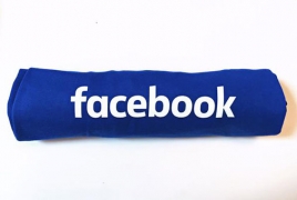
Facebook has quietly changed its logo - but it takes an eagle-eyed user to spot the difference at first glance, Digital Spy reports.
The social network has adopted thinner lettering, and a rounded-off 'a', as well as adding more white space to its emblem.
The iconic 'F' logo still remains, but the new typeface appears anywhere the social network's name is displayed in full.
"Now that we are established, we set out to modernise the logo to make it feel more friendly and approachable," Facebook creative director Josh Higgins said in a statement.
Although the change is subtle, one marketing expert believes that it highlights a significant shift in focus for Facebook.
"This is actually a huge change and it's much more than the 'a'," Howard Belk, co-chief executive and chief creative officer of Siegel+Gale, told the Wall Street Journal. "It's driven by mobile."
Clearer lettering with more white space makes wording appear more legible on mobile devices, where 87% of Facebook's traffic is coming from these days.

